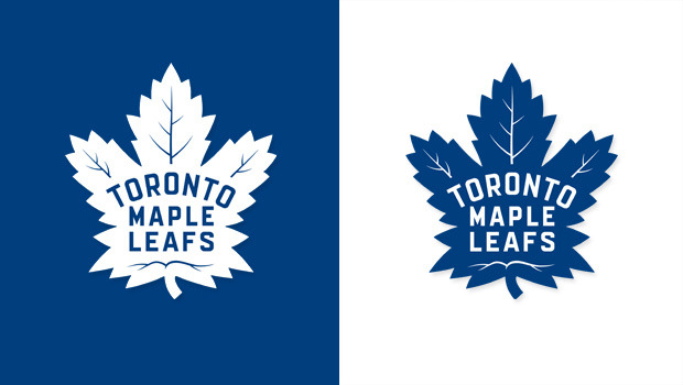
Last night the Toronto Maple Leafs debuted their new logo during their game against the Boston Bruins. It was met with a lot of fanfare, and many people enjoyed the new design that hearkens back to the 40’s through 60’s. The Maple Leafs broke down the significance of the logo:
• The new Maple Leaf has 31 points, a nod to the year 1931 and a defining moment in team history with the opening of Maple Leaf Gardens. The new logo maintains a strong connection to the classic Leafs logo of the past while offering a fresh take on it for the future.
• The new badge contains a total of 17 veins, representing the year the franchise was founded (1917), and includes 13 veins at the top of the crest to commemorate the club’s Stanley Cup Championships.
• The outline, seen in the most recent version of this Maple Leaf from 1963-67, has been removed to create a cleaner, bolder look.
In addition to this design the minor league team, the Marlies, will have a similar redesign with a crown in the middle of it. The redesign isn’t necessarily bold but it is a throwback to a good era for the Maple Leafs.

