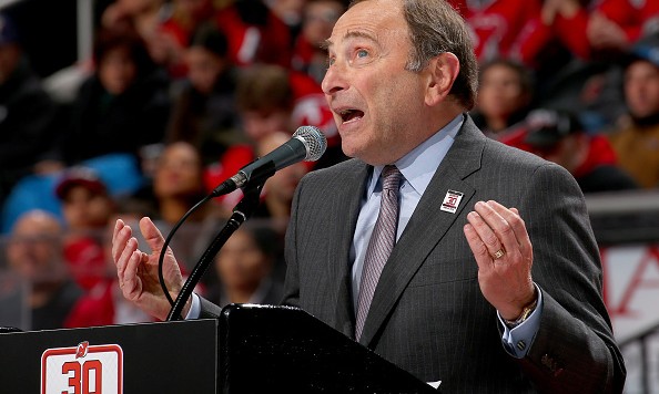
If you haven’t noticed, the NHL has a new look on its digital properties. The reaction has been poor to say the least, but it goes beyond the usual criticisms that come with a major redesign. As fans struggle to find features they used to use and adapt to the new look, Gary Bettman is more than pleased while ignoring the obvious flaws.
Gary Bettman's full answer when I asked him about https://t.co/83kUNx5pOG. #PlayWithIt pic.twitter.com/Do1zUyAOR5
— Mark Lazerus (@MarkLazerus) February 11, 2016
So … has Bettman even looked at the new NHL.com and all of its issues?
The new website feels and looks like an app, which might be fine, but why did they remove simple features that had no bearing on the look and feel of the site? If you look at the standings, they removed something even as simple as the numeric standing of each team for seemingly no reason. The player profiles limit the stats to one league at a time, so if a player spent time in the NHL and the KHL, you have to toggle between the two. The list of problems goes on and on, covering the website, the app and the league’s video services. Ease of use and functionality were clearly not in the design plans.
The old NHL website wasn’t great, but it was functional. The new iteration isn’t functional and instead of admitting there might be growing pains and that it was foolish to launch a new product in the middle of a season, Bettman is praising garbage. Why not wait until the offseason when fans aren’t counting on the site to deliver for stats and updates?
The NHL has made some nonsensical decisions and Bettman has made a ton of insane comments over the years, but the current debacle over the digital side of the league is embarrassing.

