
I feel for the Hurricanes and their fans right now. They were expecting a new and exciting new uniform to be revealed today, and instead they got rec league garb. I fully understand the 'Canes wanting to go with a sleek new look – the Tampa Bay Lightning did to great success a few seasons ago – but it just doesn't work.
The shoulder patches are gone, the checkerboard "warning flag" across the bottom has been ditched in favor of solid striping on the roads and always, and there are no more shoulder patches. Also, the crest in the middle has been shrunk down slightly (and therefore, to me at least, looks a little off-center).
They were probably going for the less-busy design that seems to signal to some "Original Six." The Bolts did it and their home jerseys look good – albeit a little like a blue version of the Flash's uniform. It doesn't harken to Original Six, though, despite the fact that they were going for a clean Detroit Red Wings/Toronto Maple Leafs look. This one bypasses even that and goes straight to what your friends wear at their Saturday night games after open skate is over.
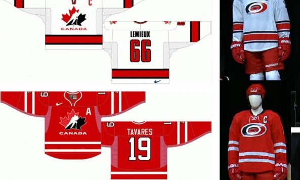
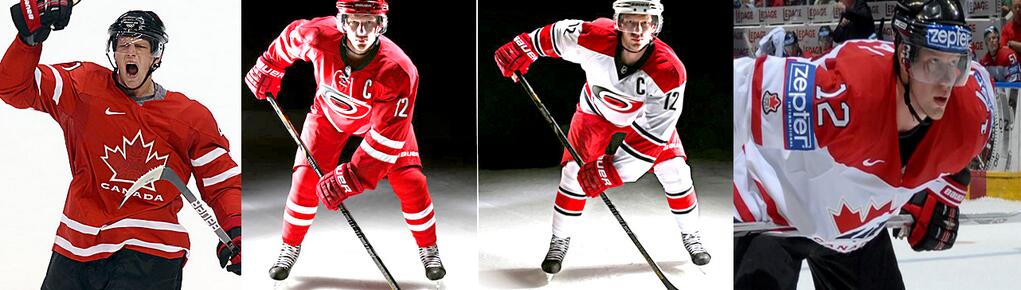
Or, if you prefer an alternate point of view, a couple folks from r/hockey have pointed out the obvious: this is Team Canada:
You know what would probably have been more well-received? Going back to the Whalers garb. You can't argue with a uniform reveal accompanied with "Brass Bonanza."
Thanks to Reddit Hockey for the brilliant comparison to Team Canada.